Sphera Design System
Intro (context + problem)
Project overview
Sphera is the only company that provides a comprehensive 360-degree view of sustainability and performance management across the enterprise, operational, and product levels. However, this industry leader did not have a solid Design System in place. This case study focuses on creating a Design System aimed at assisting Sphera's workforce with governance and foundational usage. The goal is to ensure that Sphera's end users have a consistent and reliable experience across all seventeen of Sphera's SaaS products.
To comply with my non-disclosure agreement, I have omitted and obfuscated confidential information in this case study. All information in this case study is my own and does not necessarily reflect the views of my client.

My role & timeline
I led the research, UX/UI design, and documentation of the entire project. I worked with a Product Manager, three Front-End Developers, and one Technical Writer for a year. This project is ongoing and follows a continuous process.
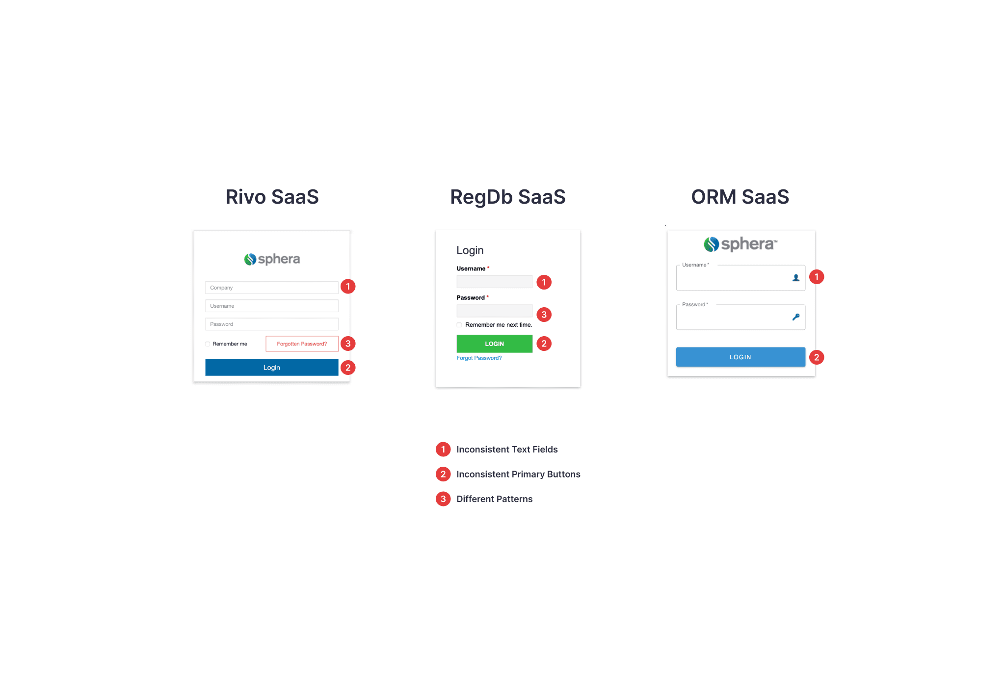
Challenge & objective
Sphera offers seventeen different SaaS products, all of which can be accessed by clients based on their subscription and permissions. Currently, the lack of a Design System leads to numerous inconsistencies in usage and visual appearance for end users. As a result, the same interactions or components can vary significantly from one product to another.
On the operational side, Sphera’s workforce invests considerable time creating components tailored to each team's specific needs. This siloed approach causes multiple developers to develop the same components simultaneously, leading to inefficiencies and redundant work.
Our aim is to establish a strong foundation of usage rules and a cohesive aesthetic for components through a unified Design System. This will reduce development time and enhance consistency in Sphera's products.
Key challenges
Minimize the creation of new components for similar needs.
Ensure consistency in usage patterns across products.
Establish governance rules for scaling, maintaining, and documenting a new Design System.
Research (insights + personas)
Understanding the users
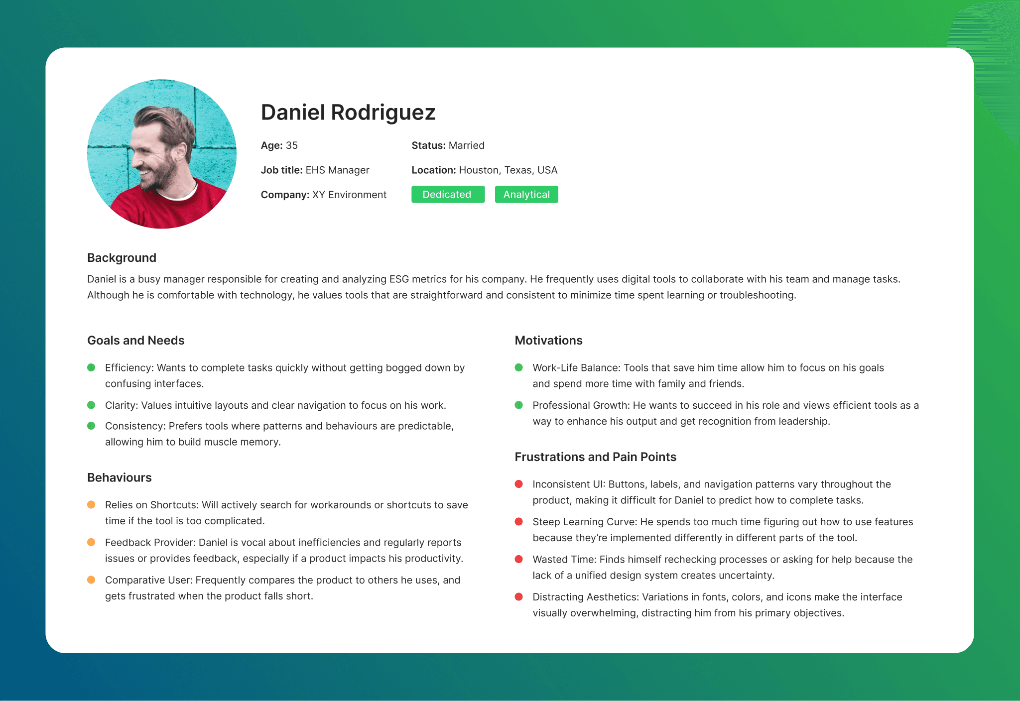
Our target users are the Sphera workforce, which includes busy professionals aged 23 to 45, such as developers, UX designers, product owners, project managers, and quality testers. These individuals often struggle to optimize their work due to the lack of a comprehensive unified design system. Additionally, we also aim to address the needs of all Sphera's end users, who experience inconsistencies in similar interactions and user flows.
Methodology & insights
Methodology:
User Interviews: Conducted 20 end user interviews with our top clients.
Internal Workforce Interview: We interviewed our internal workforce and surveyed all leadership.
Analysed Tickets: We analysed customer success tickets to make informed decisions.
Key Insights:
Users are seeking a clear set of rules and usability patterns, as they value consistency.
Our workforce desires a way to scale and optimize their workflow, save time in development, increase consistency in their projects, and reuse components.
Design System will ensure that similar actions or visual elements behave and look the same throughout the product..
Design process (ideation + iteration)
Ideation process
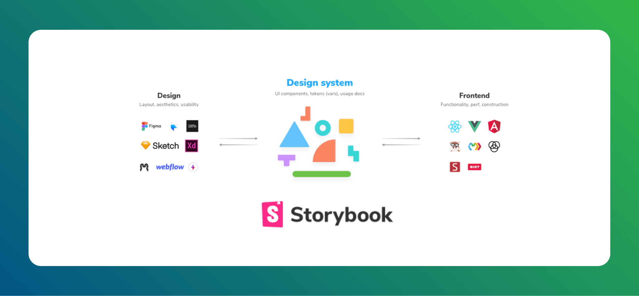
We divided our main process into two key areas: the UX/UI side and the Development side. On the UX/UI side, we conducted an intensive research phase regarding available component libraries. This research focused on various factors such as price, flexibility, and support. Following this phase, the leadership at Sphera decided to proceed with the Kendo React library.
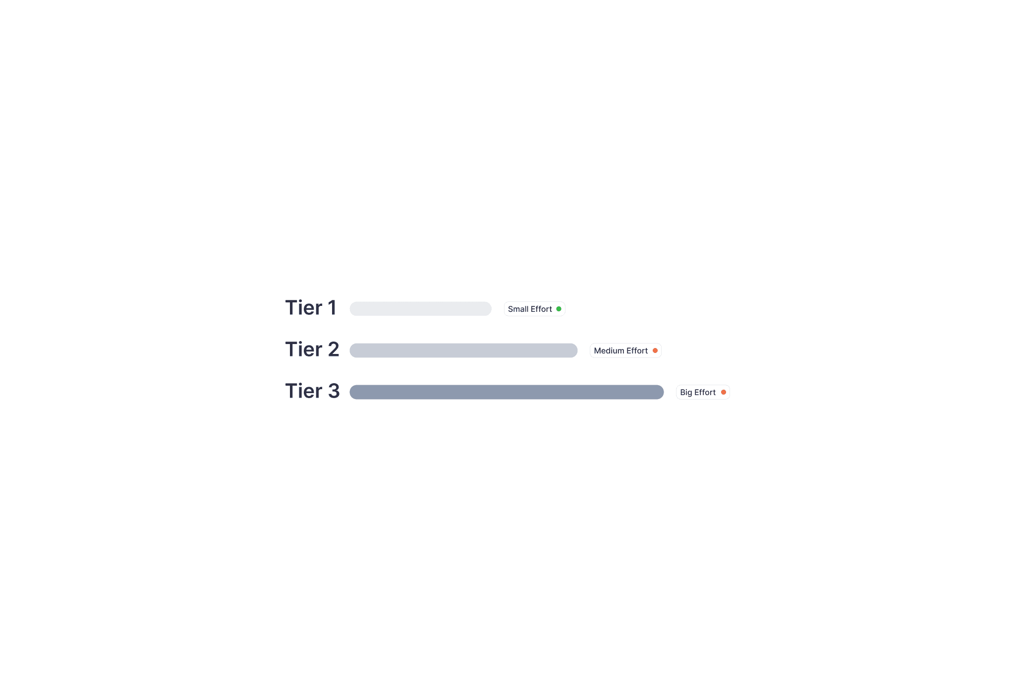
To implement this, we introduced a three-tier approach:
Tier 1: This tier is straightforward. Any developer can select a necessary component directly from the available "shelf" of the Kendo library.
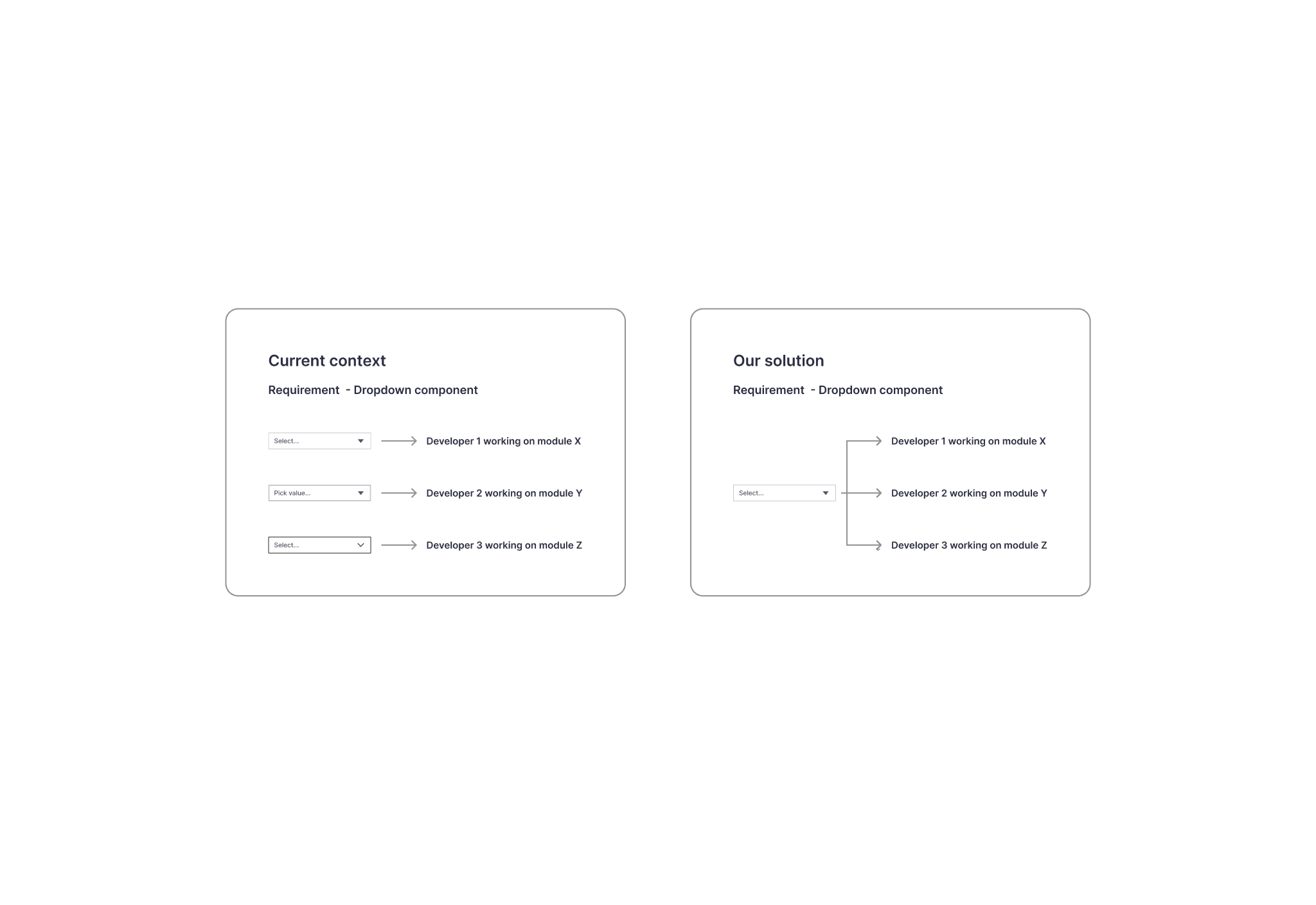
Tier 2: This tier comes into play when there is a need for small customizations to existing components in the Kendo library. For example, if a text field in Kendo lacks a clear action after input is provided, and research, metrics, and UX suggestions indicate the need for such functionality, the component will be modified. In this case, developers will implement the customization and add the new component to our library.
Tier 3: This tier is applicable when there is a requirement for a custom component tailored to a specific user flow that is not currently available in our library.
Atomic system

Solution (final design)
Final design
Common repository & component library Benefits of have a common repository and a common repository:
Add fully built and styled components from the common repository instead of creating them from scratch.
Ensure consistent UI by setting the styling, implementation, and behaviour in the common repository instead of separately for each application.
Spend more time focusing on customer needs and user experience instead of reinventing the wheel.
Environment to interactively develop UI components in isolation and visualize them in different states.
Testing components before applying into applications.
Implements based on Component Driven User Interface.
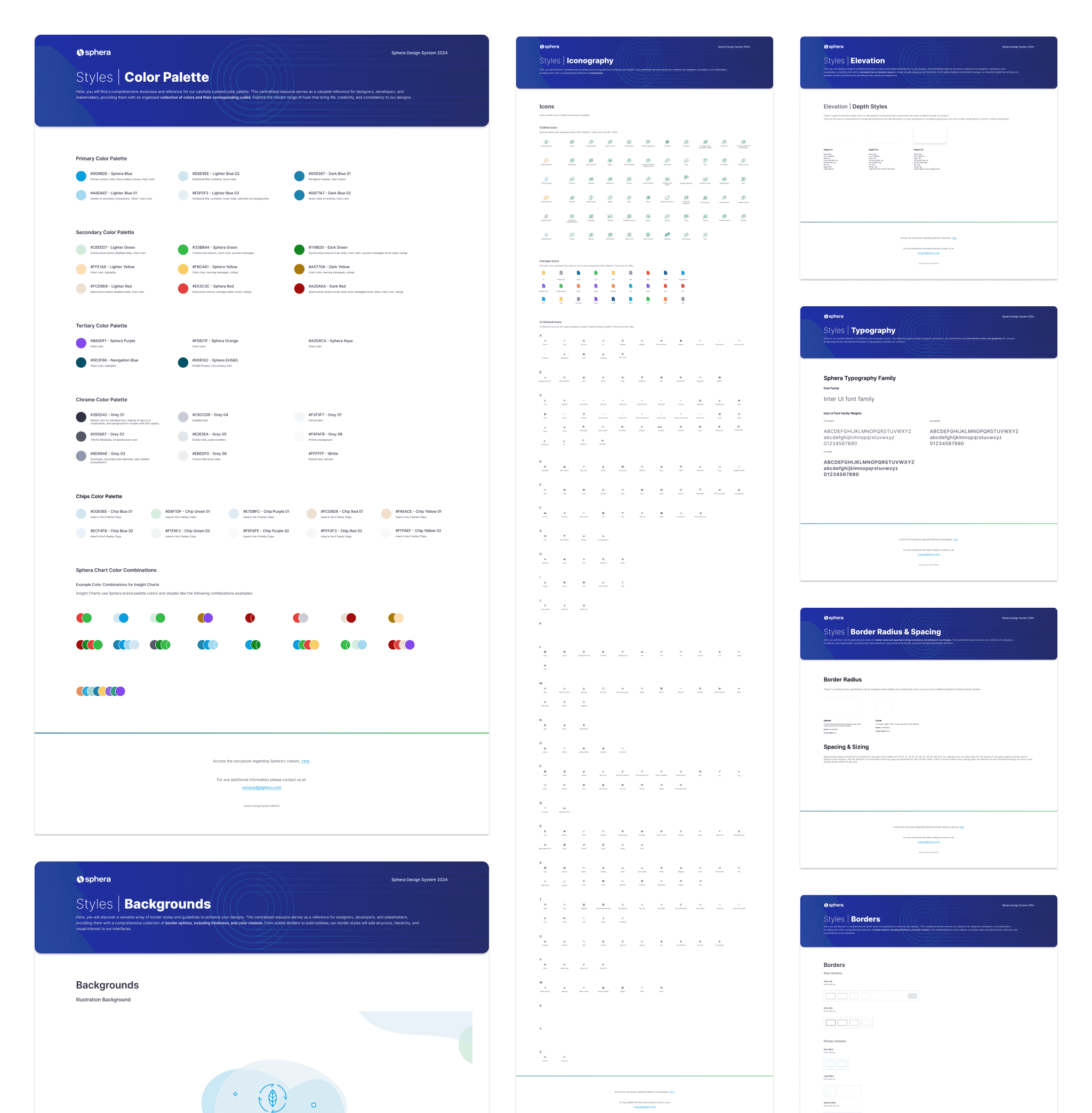
High-fidelity screens
The high-fidelity screens showcase a Sphera's Design System looks like currently.
Results (impact + learnings)
Measurable results
The Design System was implemented in one module SaaS in the first phase, afterwards the results were extremely positive, internally (Sphera workforce colleagues) and externally (Clients end-users).
Development time was reduced by 40% compared to similar projects in other modules within Sphera.
Consistency became a standard; the number of tickets generated in our customer success platform related to consistency or inconsistency of patterns and components decreased by 50%.
We received recurrent positive feedback after implementing the new Design System, with this type of feedback increasing by 65% compared to the previous three years.
After our sales team demonstrated the product using the new Design System, we signed nine contracts with new clients, which is twice the average from the past two years.
Furthermore, we achieved a 92% retention rate of existing clients one year after the implementation.

Learnings
Every digital product should have a Design System from the beginning, having a product without it will promote inconsistencies everywhere and chaotic interactions, if our users have to think every time they change page because similar cases/situations are treated differently, with different placements or looking feels, this becomes extremely overwhelming, I/ think we were able to reduce our users cognitive load with a solid Design System.
I compiled a list of valuable insights I gained from this project:
A design system is a living resource that requires ongoing maintenance and iteration to stay relevant.
Continuous user feedback is essential to address pain points and ensure the design system evolves to meet team needs.
Educating teams about the design system and its benefits fosters adoption and builds enthusiasm.
Early user testing of the design system revealed gaps in scalability, such as insufficient components for specific use cases.
A unified design system significantly reduces redundant work by offering reusable components.
Having a centralised repository with clear, accessible documentation ensures consistent use of the design system across teams.